Contrast Edge Linen Pocket Squares by Shibumi Berlin
Today's theme is contrast border pocket squares. We will look at why these pieces are one of the most important parts of a versatile and stylish wardrobe and why everyone needs at least a couple of them. The two pocket squares pictured here are from my friends from Shibumi Berlin and to be honest, this text has been long overdue.

No matter what the season, simplicity always works. Especially if you aren't Mr Rubinacci in Pitti, you will most likely want to wear something a little bit more down to Earth and less eye-catching in your daily life. In these normal day outfits, from a grey flannel suit to a classic navy sport coat + khaki chinos, contrast edge pocket squares are usually a fantastic pocket square choice. They will let you add a touch a color while retaining the elegance that comes with a simple white linen pocket square. Contrast border pocket squares will also let you further harmonize the outfit's color palette without risking a too busy look, something that is especially useful when wearing a patterned jacket or a suit.
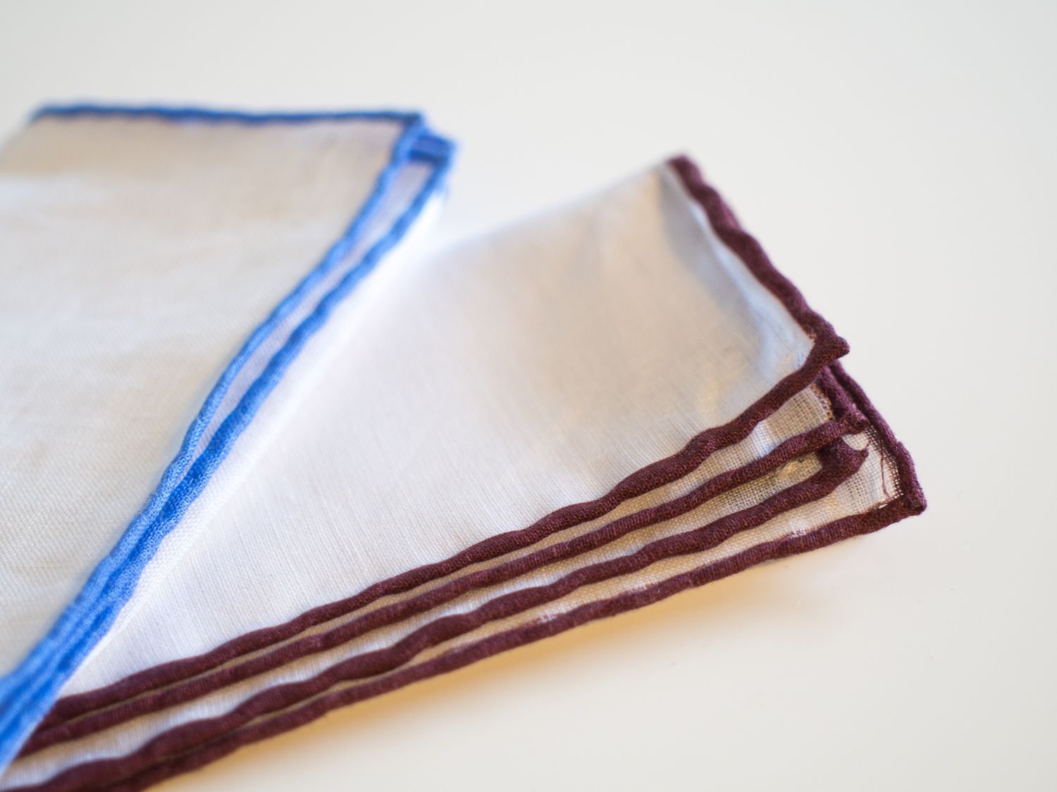
The two contrast edge pocket squares shown here are from Shibumi Berlin. Along with other beautiful pieces the German company produces and offers, they stock a good selection of contrast border linen pocket squares. I personally own a couple, and would definitely recommend them. Shibumi's contrast border squares are also very reasonably priced, and in my opinion offer the best quality for reasonable money.
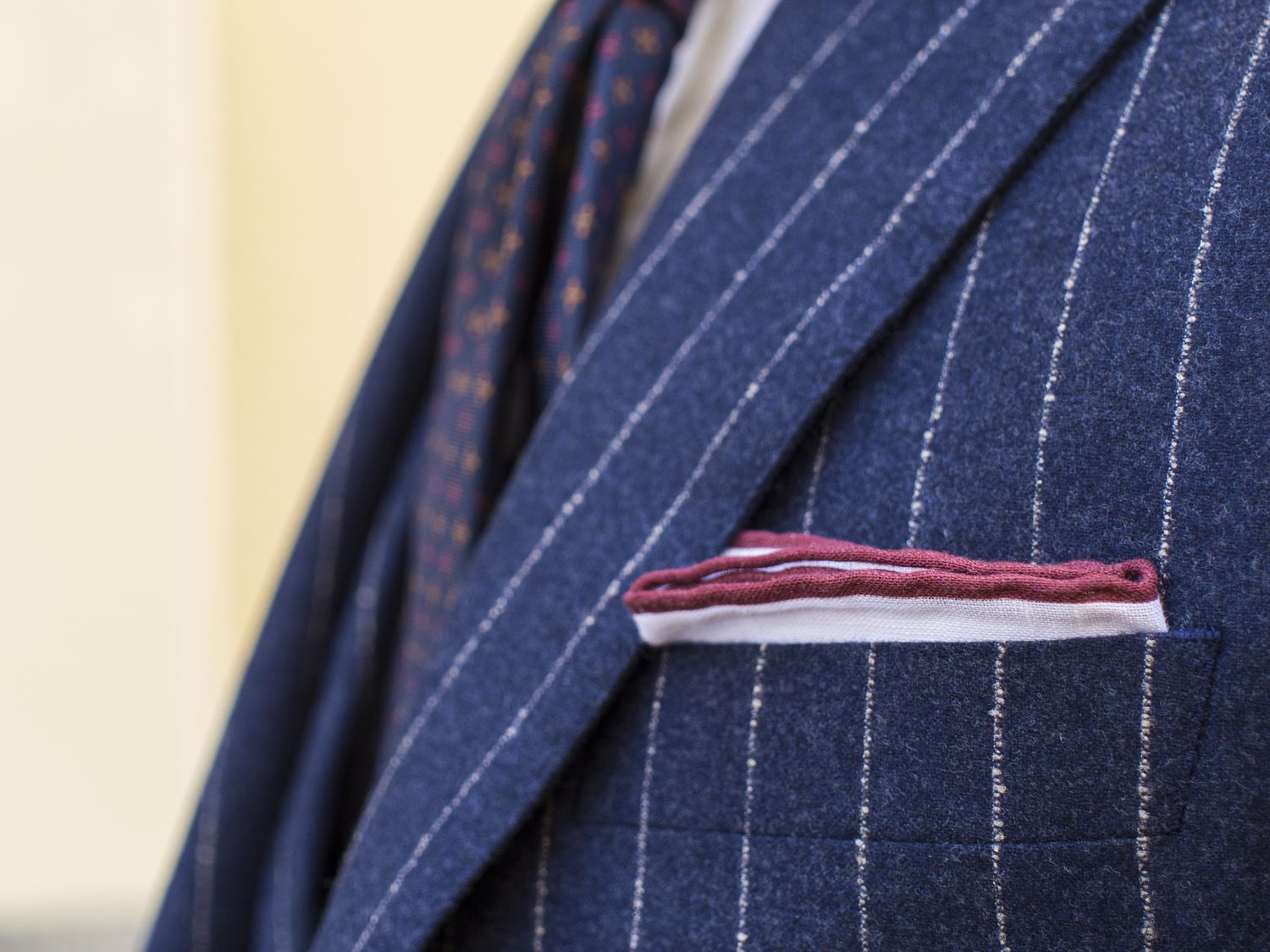
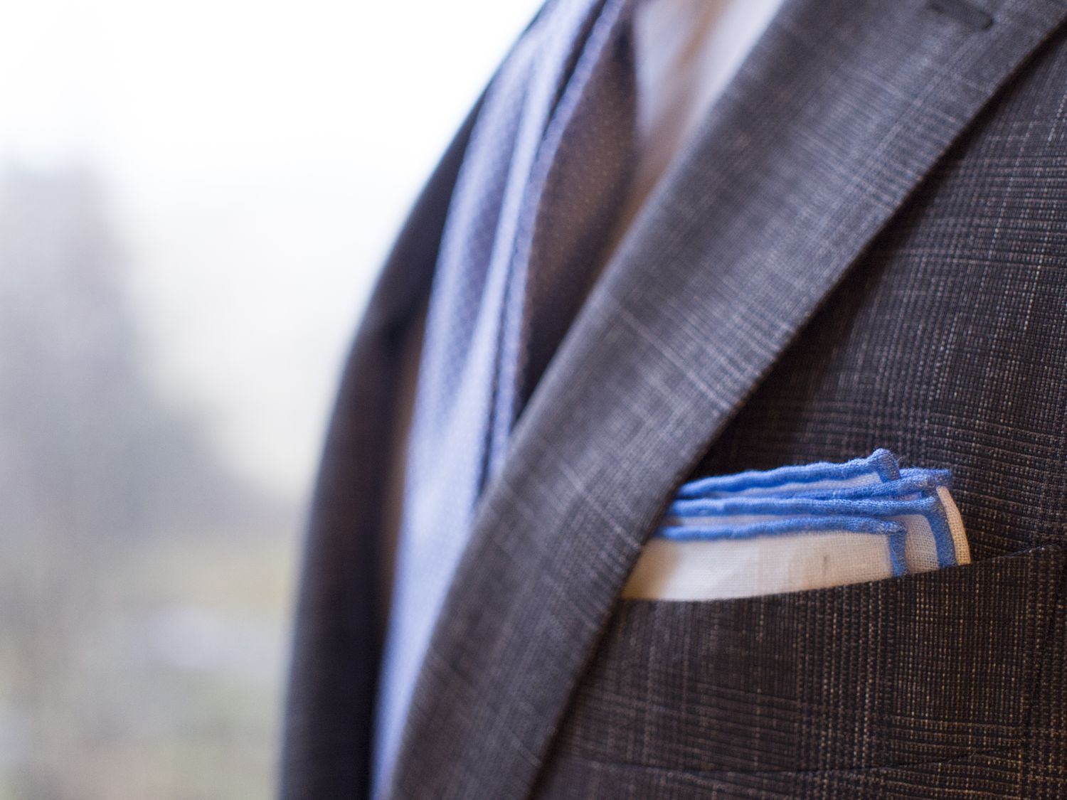
I also selected a couple of pictures where you can actually see the items implemented into a look. The first picture shows the burgundy square complimenting the burgundy crosses in the tie, and simply adds a little bit to the overall look (vs a plain white linen pocket square) while still been very simple and elegant (vs a busy printed pocket square). The second one shows the sky blue contrast border pocket square worn with a brown check suit and a sky blue cotton tie. Here, the sky blue edge compliments the tie as well as the white shirt while also having an almost soothing effect to the patterned suit. You probably wouldn't want to be using a terribly busy pocket square here, but a plain white or sky blue linen square might also feel a little bit dull.
So, there we go. I personally wear a lot of contrast border pocket squares and most of my thoughts about them have now, finally, been written down. A text that should've been written three years ago, perhaps, but better late than never. All in all, I hope you'll find some good tips from this. And as a nod to my friends in Berlin, I would definitely recommend checking Shibumi's new collection. There are some gorgeous items being offered, such as these suspenders or this tie to name a few personal favorites.