Rampley & Co - Beautiful Art-Inspired Pocket Squares
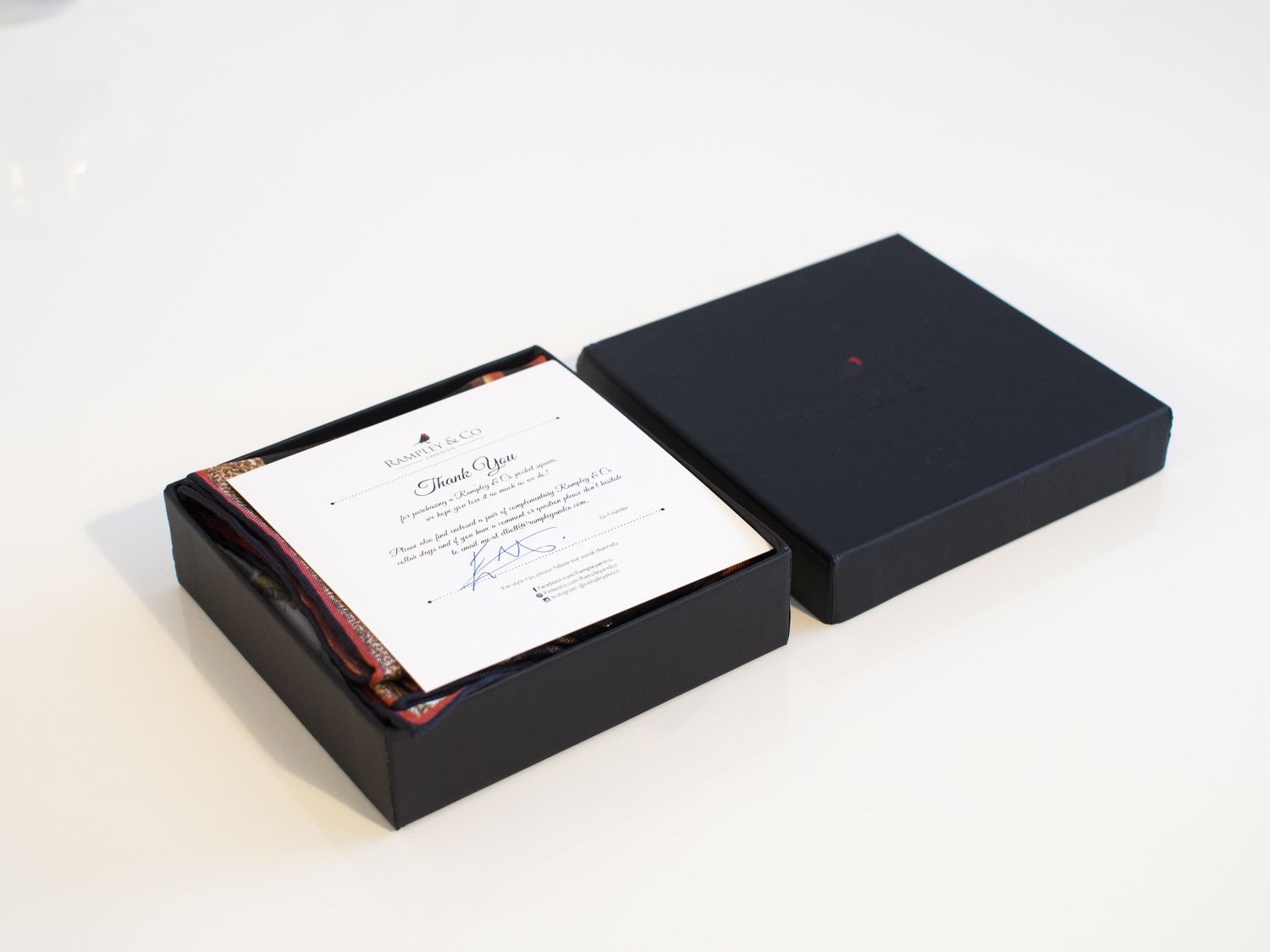
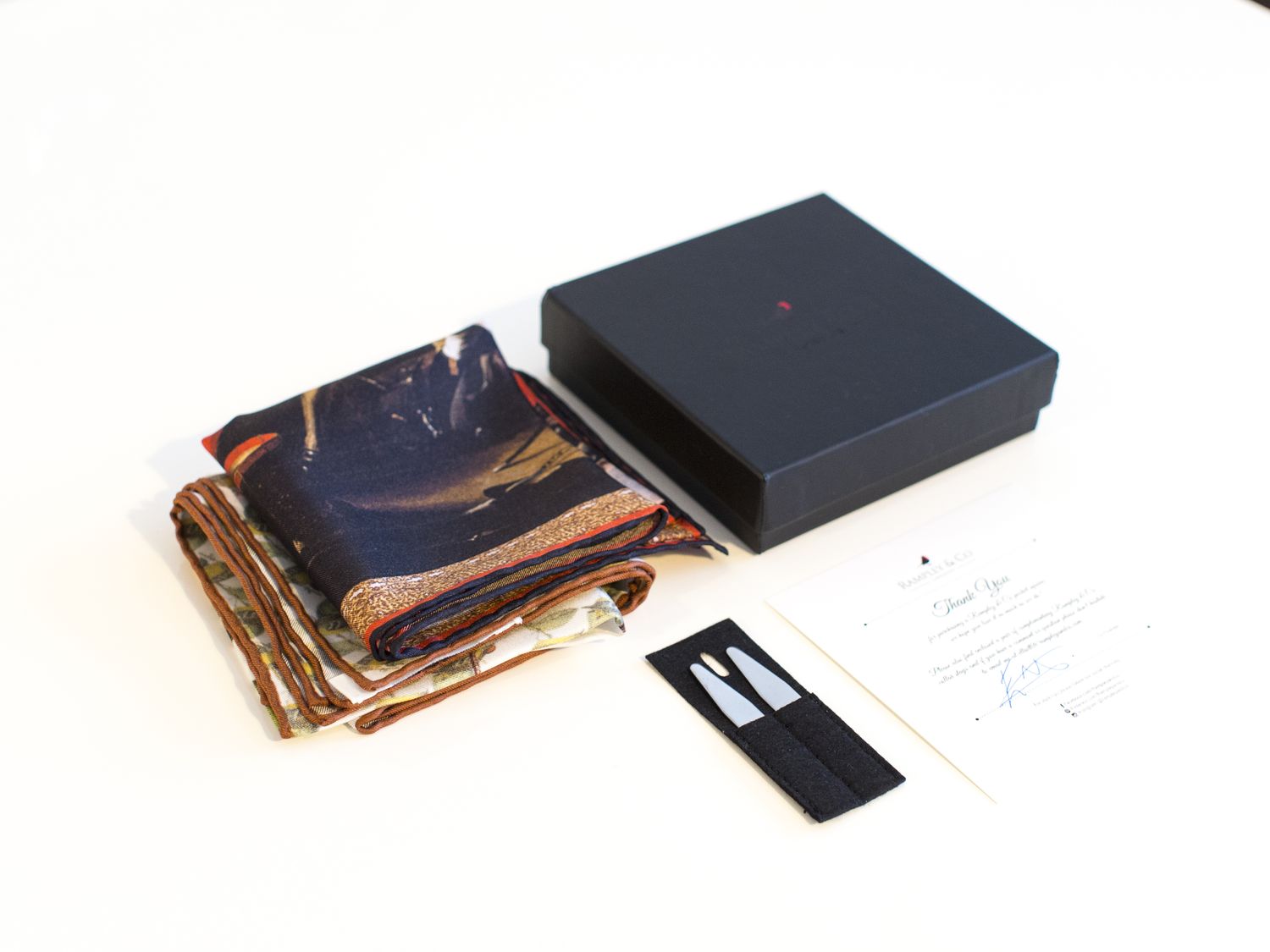
Some time ago I was contacted by Rampley & Co asking if I would review some of their pocket squares. Now, I get contacted quite a lot and I've kind of grown to expect that I will turn down the request when I see a new email pop up. In this case I must say I was very positively surprised when I visited Rampley & Co's website. A set of interesting and beautiful printed pocket squares appeared, and they even came in the best possible size of 42cm x 42cm. The art-inspired prints seemed rather interesting and the color palettes well thought out, so I was pretty much sold instantly. So, I decided to pick two pocket squares for a closer look, one from each of the most interesting collections. Read on for some thoughts on the products as well as a suggestion on how to wear it.
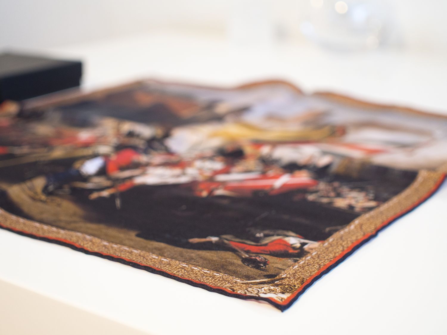
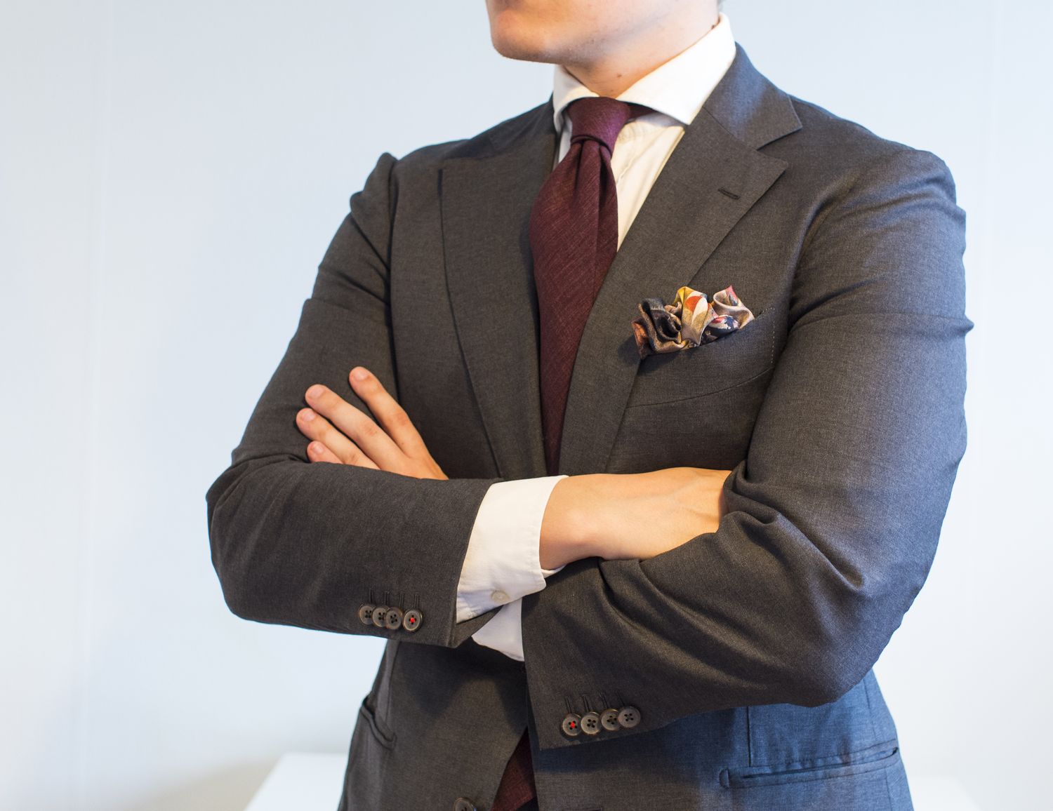
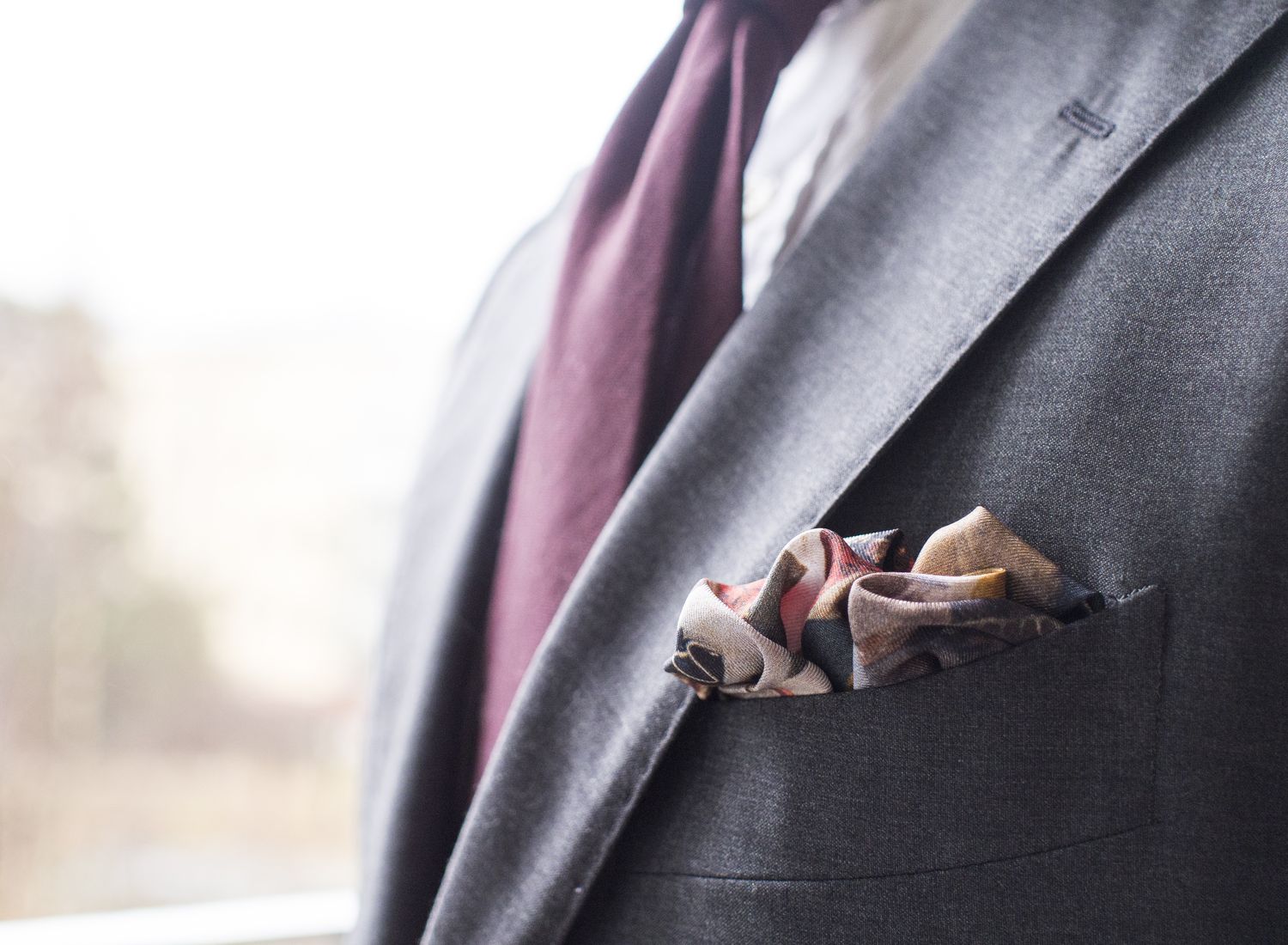
The first piece is called The Death of Major Peirson, and I guess it's clear this is a little bit more dramatic than your regular pocket square. Based on John Singleton Copley's painting from 1783, the piece depicts the death of a British major in a battle against the French in 1781. When laid flat on a table the pocket square is definitely eye-catching, but it is actually a rather restrained and versatile item that I feel goes well with different kind of outfits. The silk has a rather matte finish to it and the print job in general has a sort of a painting feel to it. The material itself has pretty much the perfect weight to it and it folds naturally into round and smooth shapes.
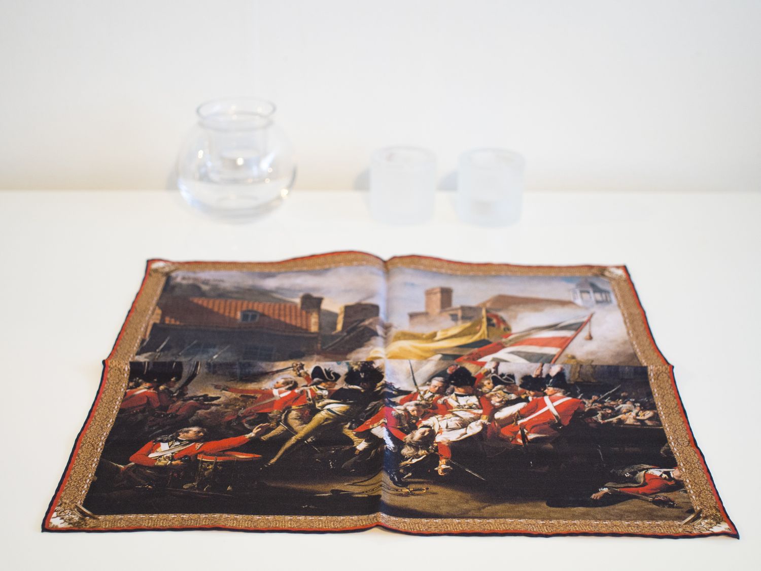
Due to the colors found in this pocket square, I mainly see it used during fall and winter seasons. The metallic shades and the shades of red, white, bronze and very dark near black colors give it a sense of drama without being loud, something not easily achieved. I personally see The Death of Major Peirson paired best with a mid grey or dark grey suit, perhaps a navy flannel suit or even a dark green jacket. An example on how to use it can be seen below, where I've also gone for a soft of "complicated puff fold".
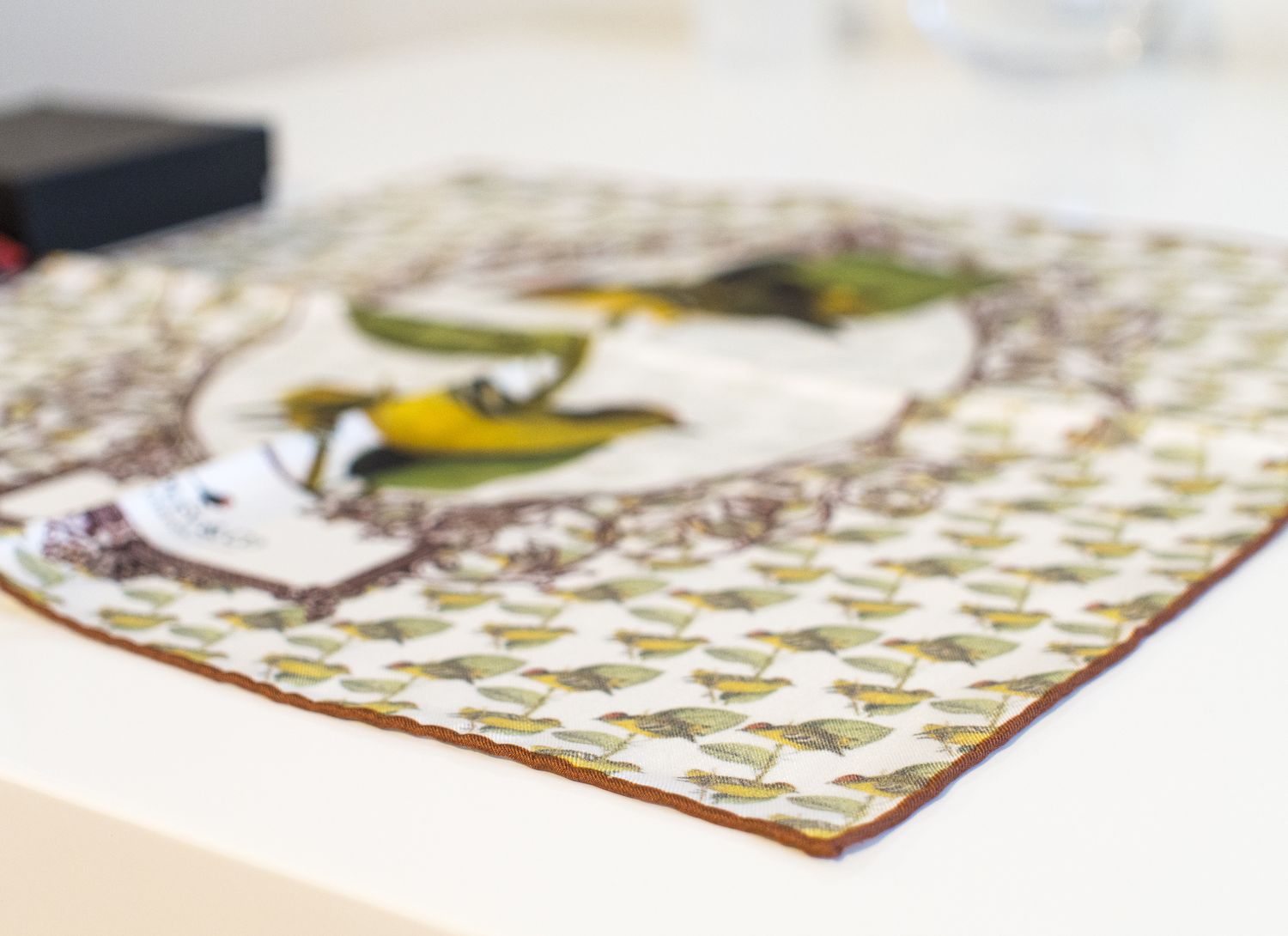
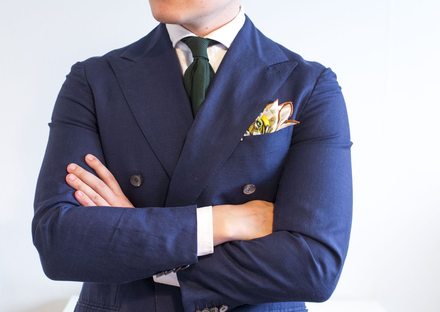
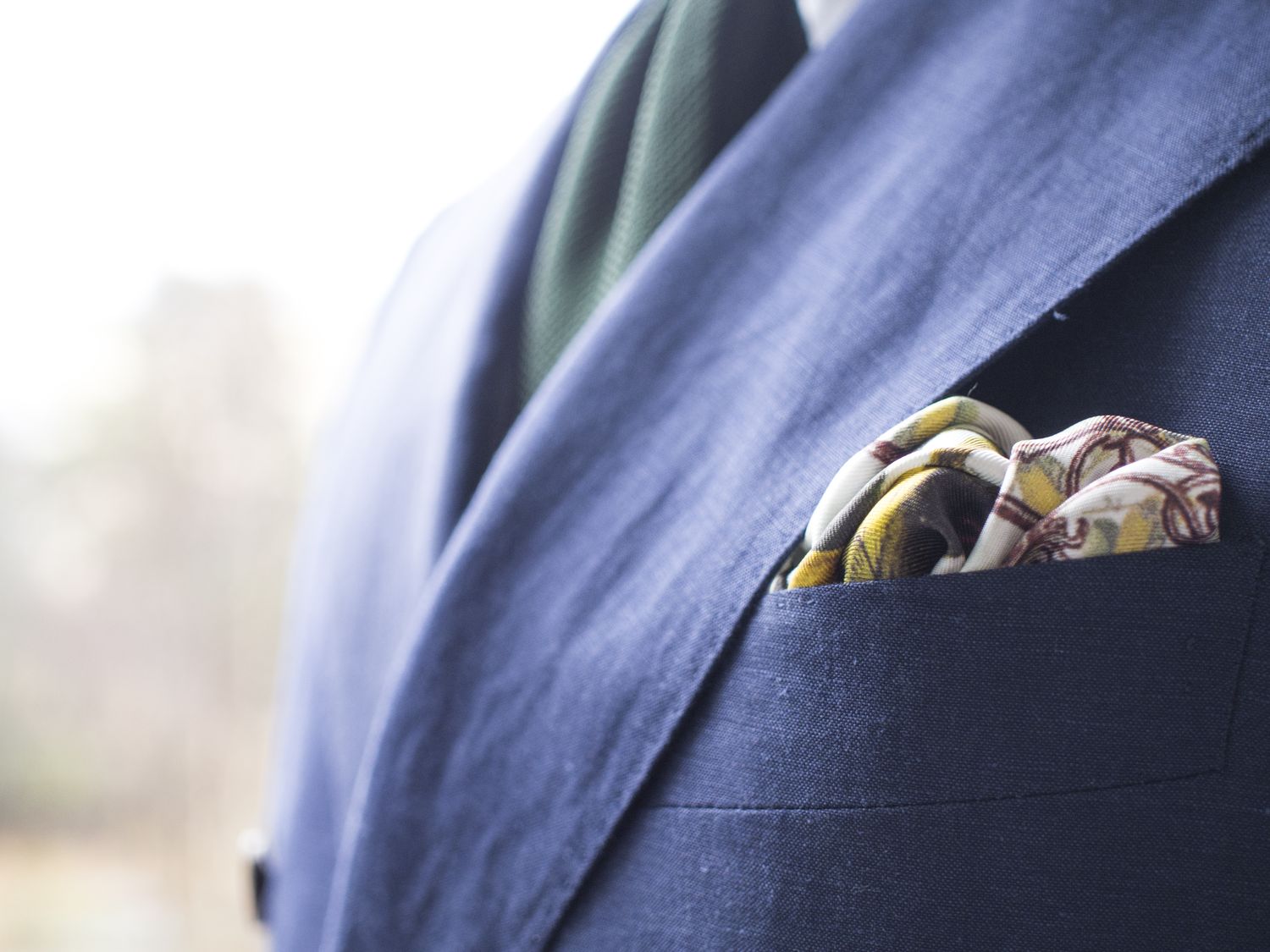
The other piece I chose for the review is called The Kinglet Calyptura Pocket Square and is based on William Swainson's work from the 19th century. I must say I absolutely love this pocket square. For a long time I've been looking for something to wear with my green ties, but never found anything I liked all that much. This one though, this is it. The colors are perfect to be worn with a dark green or perhaps a rust grenadine tie, and the print simply oozes fresh spring style. The rust border is also a nice touch, enabling you to make some pretty epic folds with ease.
I'd also definitely check out the other William Swainson collection pieces, as they're all pretty damn good-looking. One of the reasons I like these so much, is that they're actually large-sized matte finish pocket squares with a white base color - something that is incredibly hard to find. Most large prints come with a more colorful base color, something I find quite unfortunate. White is, after all, the freshest of colors and I personally love wearing different kind of white pocket squares. The color palettes in the Swainson collection squares are also pretty perfect with muted matte finish colors that are simply less shouty and therefore more elegant.

The Kinglet Calyptura works with almost any kind of spring or summer outfit, and if you look past the birds it naturally a good choice all around the year. To give you an idea, I put it on here with an E.G. Cappelli made-to-order grenadine tie and a wool linen double-breasted suit. The first fold is a little bit more extravagant while the second example is the more restrained option.
Next weekend we'll probably continue on the more educational line, depending a little bit how much time I will have to prepare something.